

In a bold move that blends technological finesse with artistic depth, Apple is introducing a New Liquid Glass Design that reimagines the user experience across every platform — iOS 26, iPadOS 26, macOS Tahoe, watchOS 26, and tvOS 26. This isn’t just a visual update; it’s a foundational shift in how Apple’s software looks, feels, and responds — combining translucency, light, and motion into a material that feels alive.
Liquid Glass is more than beautiful. It transforms dynamically based on the context, surrounding colors, or lighting conditions. It sits at the core of a unified design system that stretches from the iPhone Lock Screen all the way to the Apple Watch Control Center. In doing so, Apple is doing what it does best: using precision design to make powerful technology invisible.
What users will notice first is a heightened sense of harmony. Buttons and menus gently refract their environments. App icons feel dimensional. Widgets shimmer with depth. And despite this expressive leap forward, the interface retains the same intuitive familiarity that Apple has always prized.
This new design direction isn’t isolated — it’s Apple’s biggest cross-platform visual overhaul in years, crafted to reflect the company’s vision of seamless continuity across devices. As Alan Dye, Apple’s VP of Human Interface Design, said, “It combines the optical qualities of glass with a fluidity only Apple can achieve.” From subtle specular highlights to context-aware transformations, Liquid Glass brings the ecosystem together under a single, elegant visual language — one interface to unite them all.
A New Look for All Platforms
For the first time, Apple is rolling out a unified design language across all major platforms — iOS, iPadOS, macOS, watchOS, and tvOS — with the New Liquid Glass Design serving as the connective thread. It’s a radical evolution in aesthetics and behavior, but it’s built on foundations that Apple users already know and love. The goal is seamless harmony: a visual style that adapts effortlessly to each device, yet still feels inherently Apple.
This new design also isn’t about sameness — it’s about synergy. Liquid Glass reacts in real time to movement and lighting, with highlights that shimmer subtly as you scroll, tap, or switch apps. Whether you’re using an iPad with a Smart Keyboard, glancing at notifications on an Apple Watch, or browsing the Apple TV interface, the material transforms to enhance legibility and draw focus to content. It’s alive in a way that static elements never were.
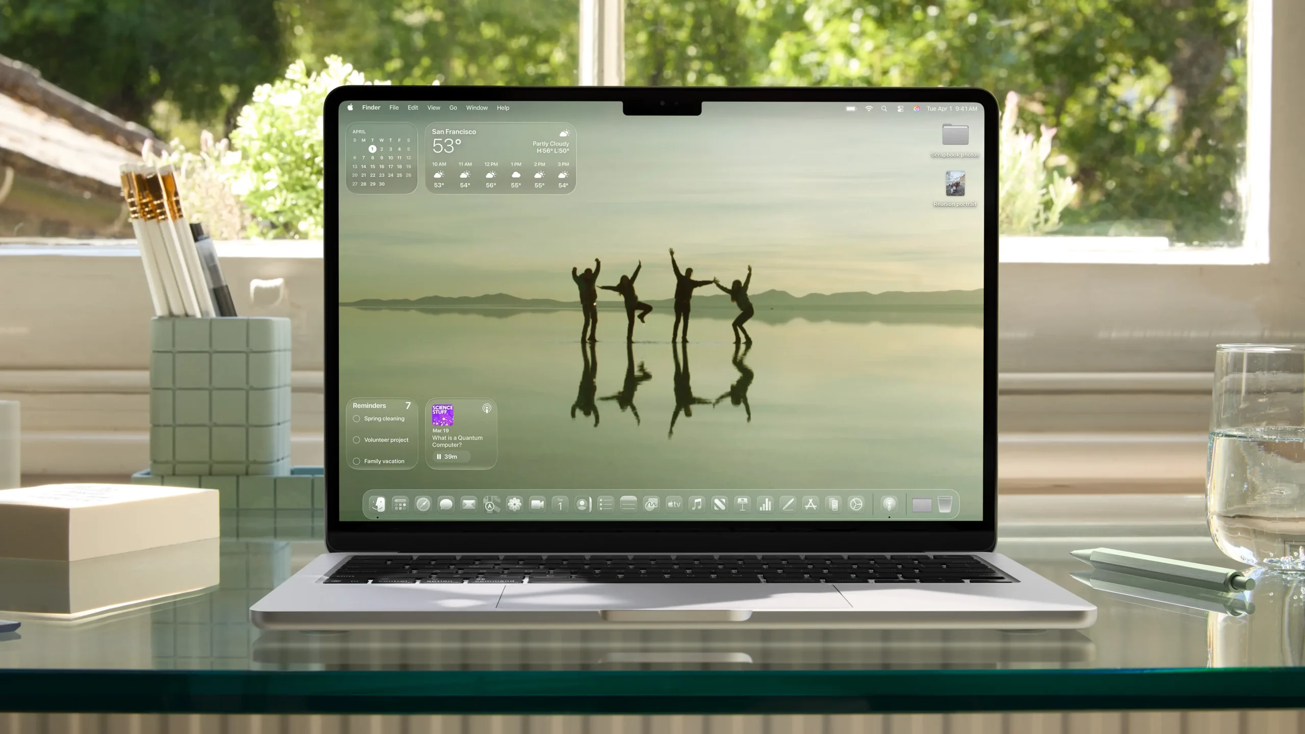
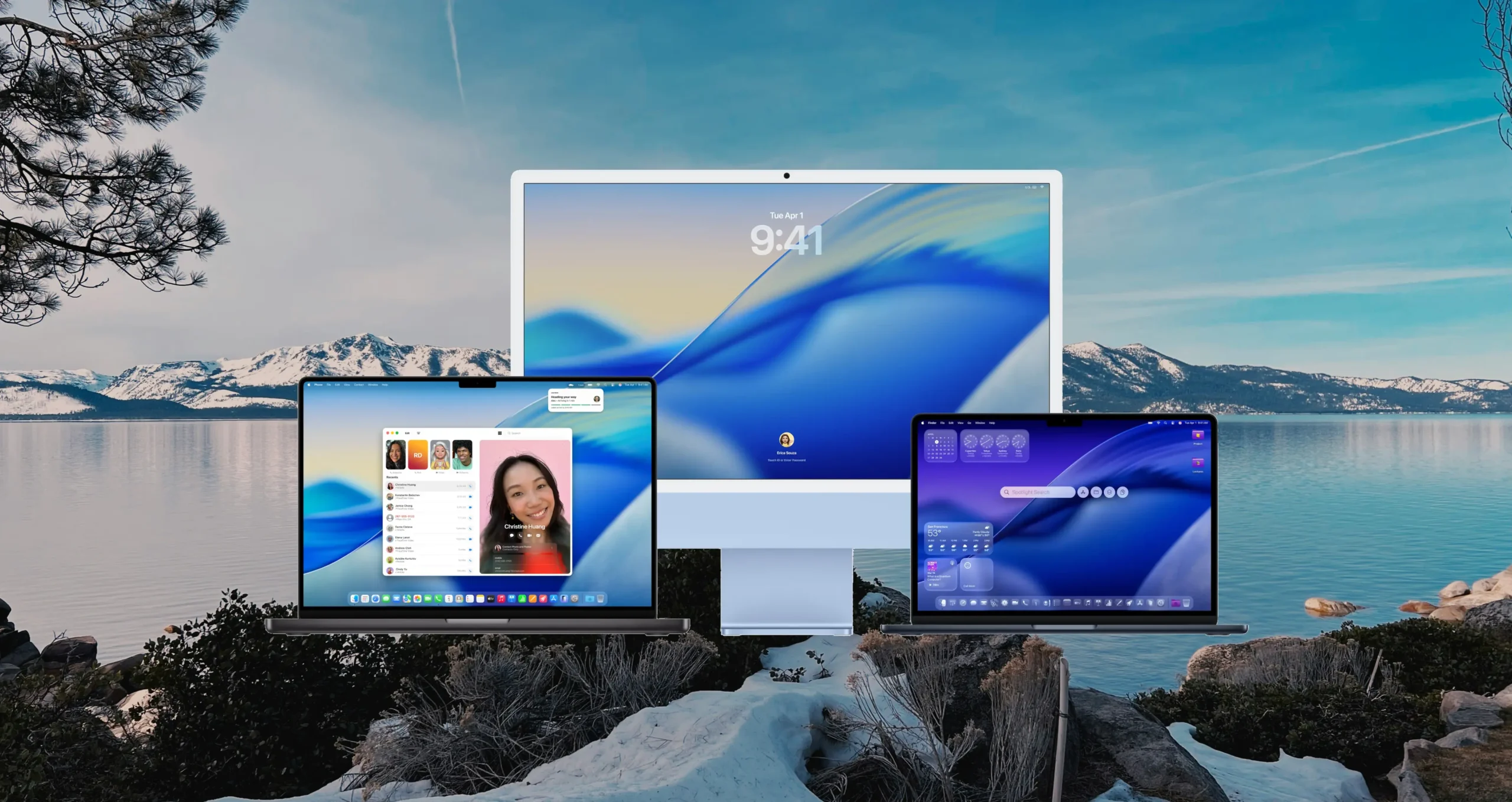
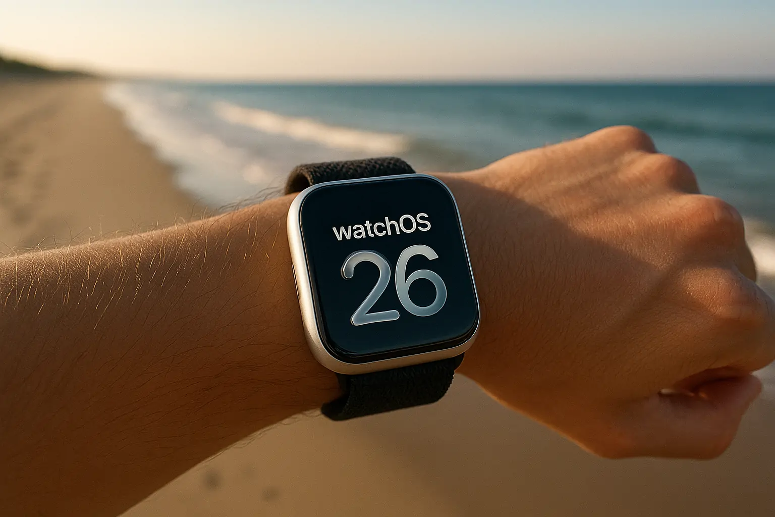
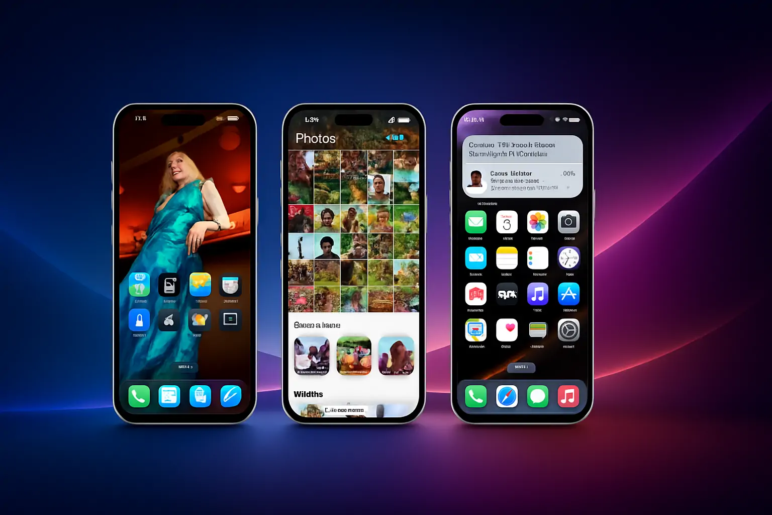
Across the system, traditional UI chrome has been reimagined. Buttons, sliders, and menus crafted from Liquid Glass feel dimensional and tactile, refracting the background environment while maintaining contrast for accessibility. On iPhone, controls float over blurred backgrounds that mirror the user’s wallpaper, while on macOS Tahoe, the Dock and menu bar take on new clarity with transparent layering. And on Apple Watch, even small elements like the Smart Stack and Photos face now carry this luminous effect.
Importantly, this design is not just visual — it’s functional. The new Liquid Glass design enables content-aware behavior, such as numerals on the Lock Screen nestling behind wallpaper subjects, or sidebars on iPad refracting both content and background in real time. The result is a more immersive, more personal interface across devices. With this rollout, Apple has established a singular design system — elegant, fluid, and unmistakably Apple.
The New Liquid Glass Interface Design
The heart of Apple’s new design language is the Liquid Glass interface — not just a visual layer, but a dynamic material that interacts with content, context, and input in real time. It’s a rethinking of how software elements should behave, blending depth, transparency, and motion to make interactions feel more natural and alive.
Liquid Glass is designed to reflect and refract its environment. That means buttons, sliders, sidebars, and other interface elements no longer feel like flat UI components pasted on top of content — instead, they shimmer with light, curve with movement, and adjust in real time to what’s behind them. The interface is made to feel like a part of your device’s physical presence, reacting to tilts, scrolls, and taps in subtle, beautiful ways.
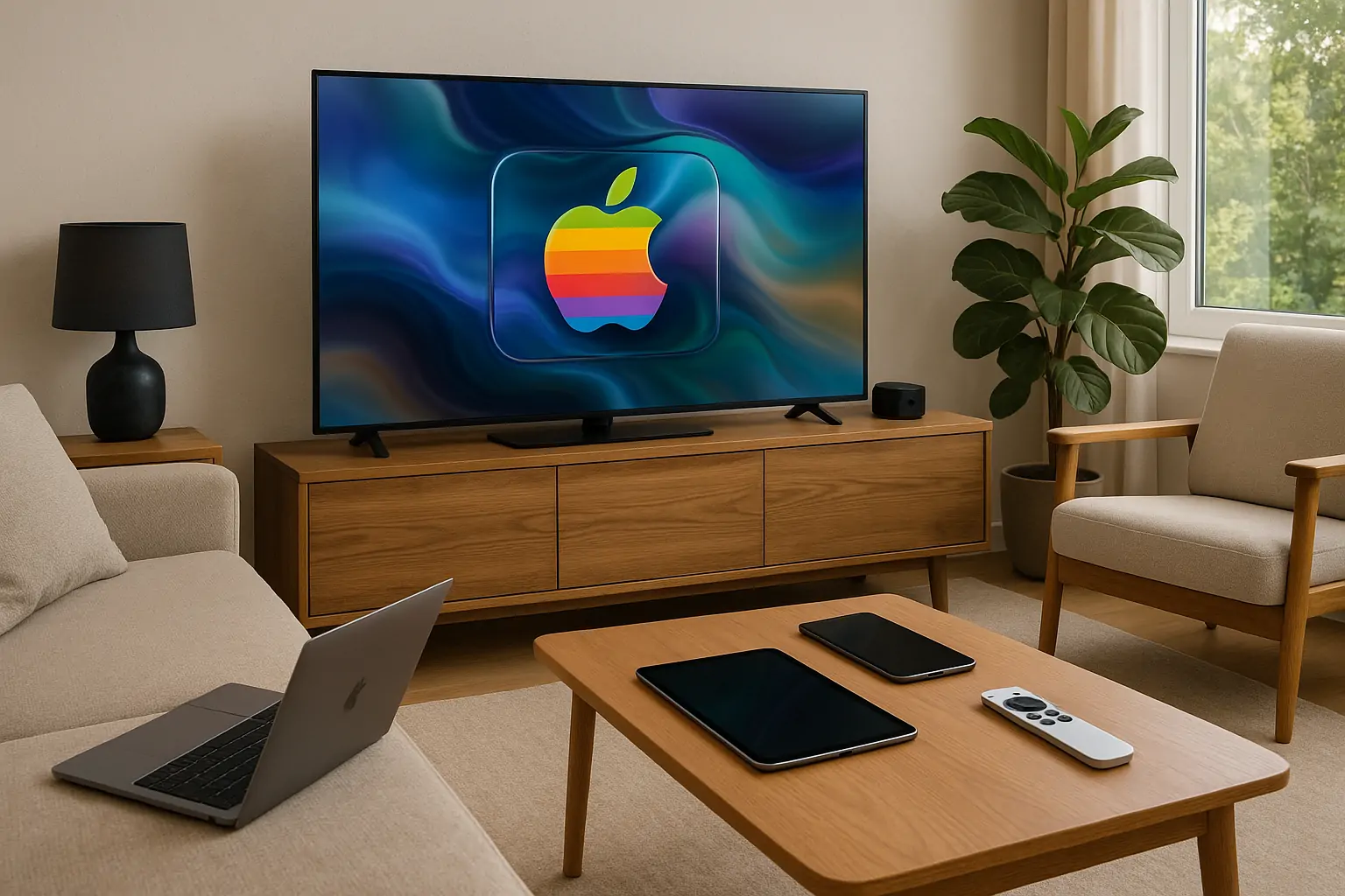
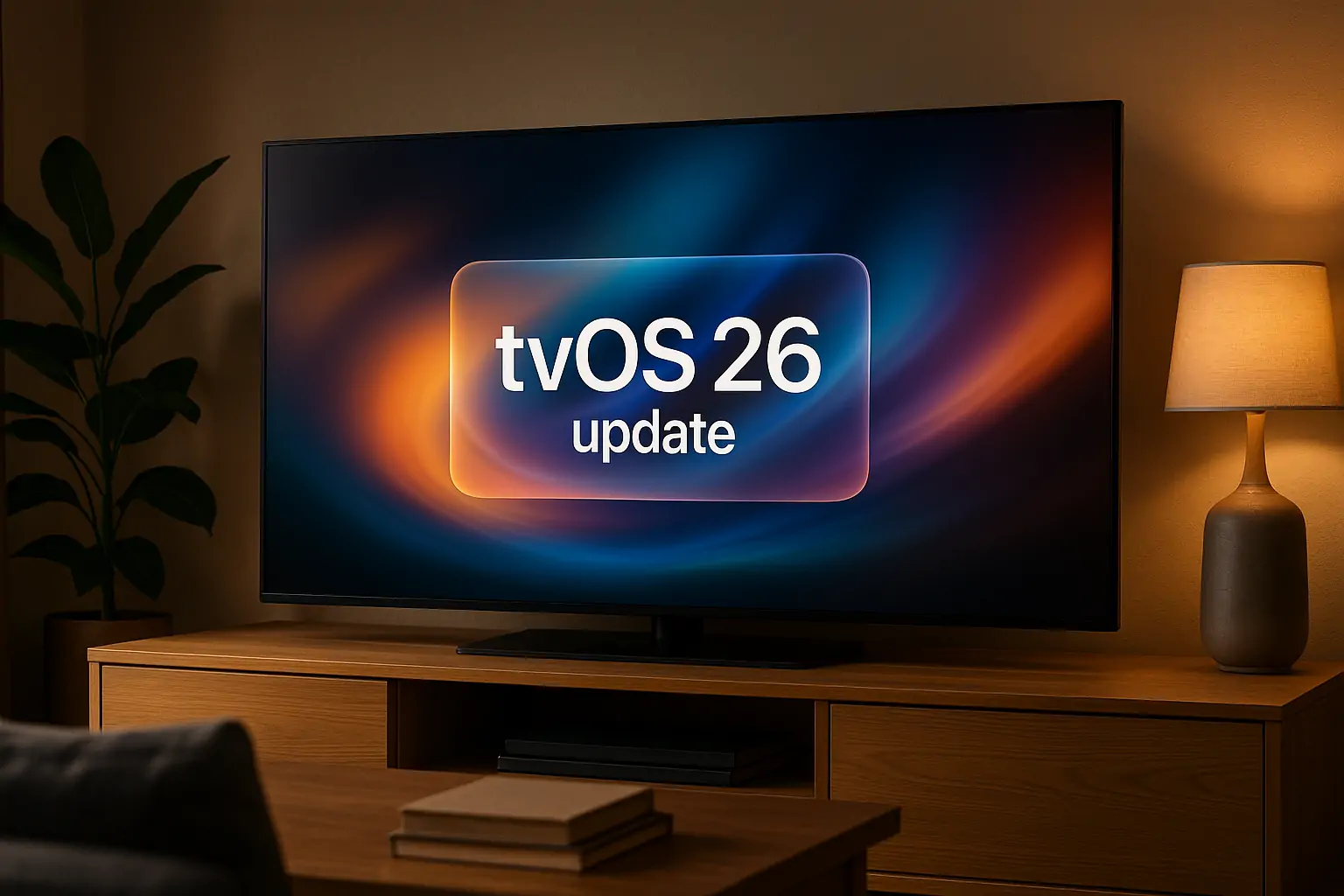
Unlike traditional static backgrounds or overlays, Liquid Glass morphs based on what you’re doing. On the Lock Screen, the time display gently contours around the subject of a photo, maintaining legibility while celebrating the wallpaper. In navigation bars, Liquid Glass adds translucency and motion that reacts as you swipe through content. And on tvOS 26, the Apple TV app uses cinematic poster art layered behind liquid elements, making everything from thumbnails to menus feel dramatically more immersive.
This interface innovation also includes adaptive lighting — the new Liquid Glass design smartly shifts between light and dark depending on system appearance or wallpaper, and carries soft specular highlights that respond to user input. The material can go from vibrant and energetic to muted and minimal depending on your context.
Liquid Glass marks Apple’s most expressive UI to date. It feels less like a veneer and more like an integrated, living surface. From Control Center to widgets, from Safari to FaceTime, the new interface is cohesive, intuitive, and undeniably elegant.
Updated App and System UI
Building on the Liquid Glass foundation, Apple has redesigned key parts of the system UI and core apps to feel more focused, fluid, and harmonious across devices. With iPadOS 26, iOS 26, and macOS Tahoe, the redesign is not about radical reinvention — it’s about refined coherence. Every element, from controls to navigation, now aligns more intuitively with the device it runs on and the content it serves.
Controls like buttons, sliders, and switches are now sculpted from Liquid Glass, appearing as semi-translucent elements that rest above the content, catching light and adapting to background colors. They’re no longer static utilities but active, visual participants in the interface. On iPad, these controls now hug the rounded corners of the screen more precisely, and their layout flexes based on content context — minimizing distraction while enhancing usability.
Apple’s design team has also rethought navigation architecture. In iOS 26, tab bars shrink on scroll and expand when needed, bringing user focus to content while keeping navigation accessible. On larger devices like iPads and Macs, redesigned sidebars refract surrounding wallpaper and app content, giving users an ambient sense of where they are in the app while preserving legibility and structure.
This philosophy extends to apps like Camera, Safari, Photos, Music, and Podcasts, which now all share the same design logic and visual depth. In Apple News and FaceTime, for instance, navigation has been refined to feel less like jumping between layers and more like moving through a unified space.
Crucially, system areas like the Home Screen, Dock, Control Center, and notifications have also adopted this layered Liquid Glass aesthetic. App icons now float in translucent clarity; widgets feel tactile; the Dock adapts to ambient lighting. These aren’t flashy changes — they’re meaningful shifts in how familiar things feel to use.
Personalization and Depth on the Home Screen
The new Liquid Glass design introduces an expressive layer of depth and dynamism to the Home Screen and system interfaces across Apple’s platforms. Whether on iPhone, iPad, Mac, Apple Watch, or Apple TV, users will notice how interface elements — from app icons to the Dock and widgets — now feel more immersive, responsive, and alive.
Crafted from multiple translucent layers, each refined with real-time rendering and specular highlights, Liquid Glass elements adapt seamlessly to light and dark modes, wallpapers, and user context. This allows content to take center stage, while maintaining a strong sense of structure and spatial orientation. The Dock and app icons visually interact with the user’s background, shifting subtly with device movement and lighting conditions to maintain legibility while enhancing dimensionality.
What’s more, the San Francisco typeface itself has been reengineered to complement this visual architecture — particularly in the Lock Screen’s time display — with dynamic scaling in weight and proportions, so numerals nestle organically around subjects in photo wallpapers. It’s a small but powerful detail that further contributes to a harmonious feel.
On larger screens, such as Mac and iPad, the system offers even greater opportunities for personalization. Users can choose between light or dark Liquid Glass tints, or opt for a completely clear look. Widgets and icons come to life within this new aesthetic, making every interaction — from launching apps to checking notifications — feel fresher and more tactile.
New Liquid Glass Design Adoption and APIs
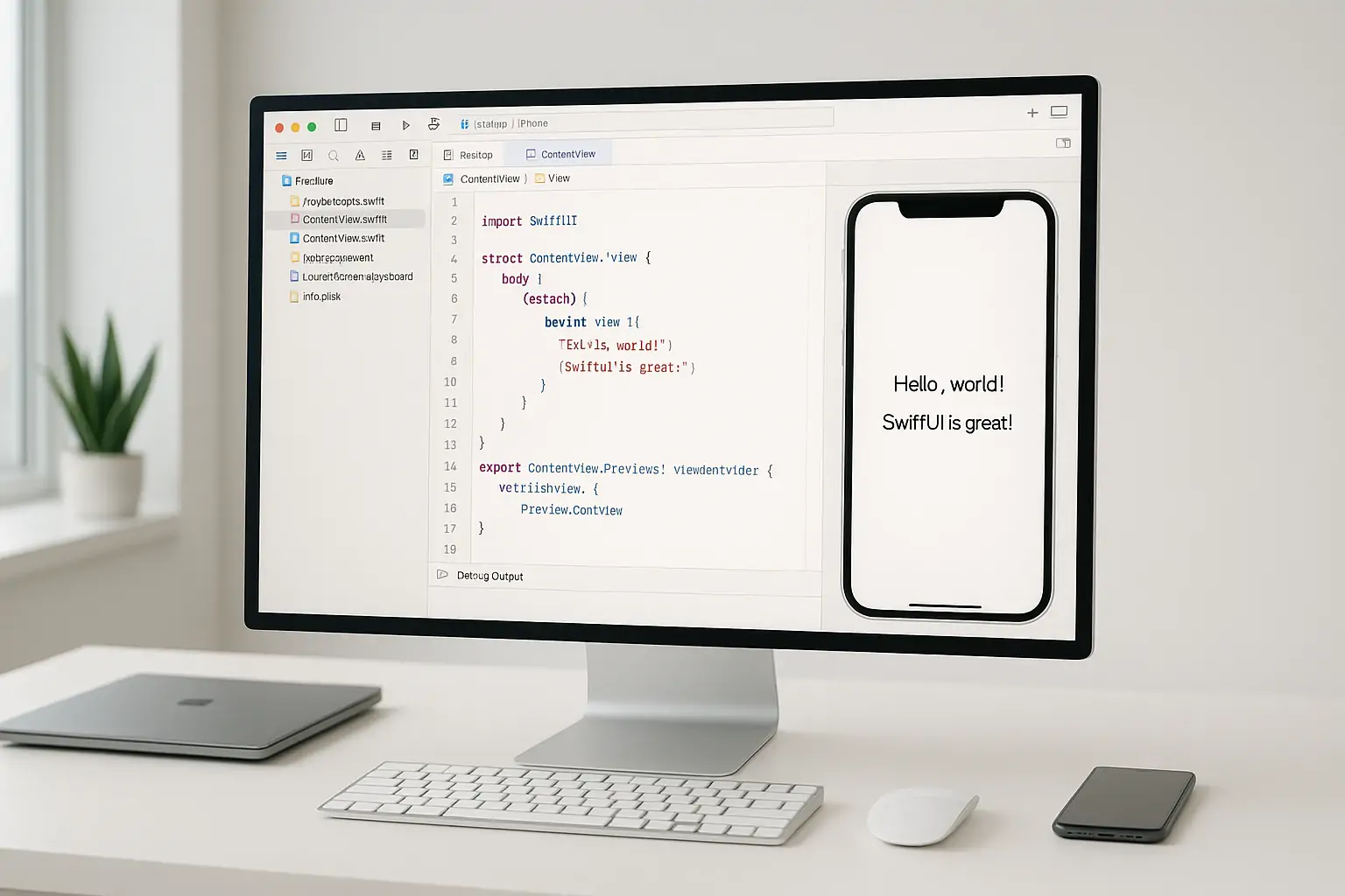
To ensure consistency across third-party apps and system interfaces, Apple has introduced a suite of developer tools and APIs specifically for adopting the New Liquid Glass Design. These resources are available across SwiftUI, UIKit, and AppKit, giving developers a streamlined path to refresh their app experiences while aligning with Apple’s latest design language.
The updated controls — including buttons, sliders, tab bars, and sidebars — have been reimagined to work in harmony with Apple’s modern hardware, reflecting rounded edges and fluid transitions. Developers can now build with Liquid Glass materials that dynamically respond to user interactions, environmental light, and background content. This enables apps to maintain their own identity while visually blending into the system with polish and precision.
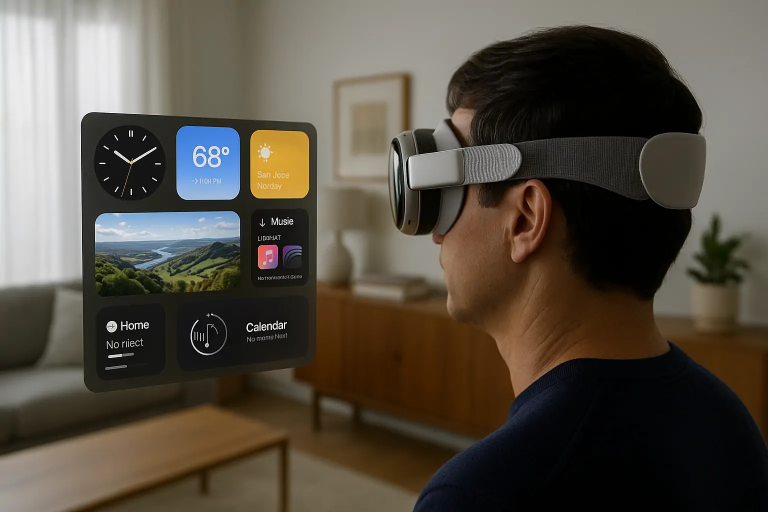
A key aspect of this design evolution is that it’s cross-platform by nature. The same APIs empower developers to bring these effects to iOS, iPadOS, macOS, watchOS, and tvOS — ensuring visual and interaction consistency, whether the app is running on a wrist, a desktop, or a living room screen.
By adopting these new tools, developers can bring a greater sense of delight and context-awareness to every app experience, making their software feel right at home in Apple’s unified interface ecosystem.
A Unified Future, Shaped by Liquid Glass
The New Liquid Glass Design is more than a visual refresh — it’s a foundation for the next era of Apple software. By bringing together the familiar and the futuristic, Apple has crafted a design language that transcends device categories while honoring what makes each one unique. This cross-platform harmony doesn’t dilute identity — it refines it.
From the Lock Screen of an iPhone to the Control Center on an Apple Watch, the Mac desktop, and the Apple TV interface, every interaction now feels more organic, expressive, and alive. It’s a design that responds in real time to content, context, and user behavior — reflecting a world where information is fluid, not fixed. The result is a more intuitive, personalized, and emotionally resonant experience.
This isn’t just about aesthetics. The New Liquid Glass Design sets the stage for deeper integration of intelligence, personalization, and ambient computing. Developers are already being invited into this vision through new APIs, while users get to enjoy a more seamless and delightful experience across devices they already love.
With Liquid Glass, Apple isn’t just unifying its platforms — it’s reframing what modern software can be. One interface to unite them all, indeed.